
Messaging, value proposition, brand identity and website for an urban Chicago bank
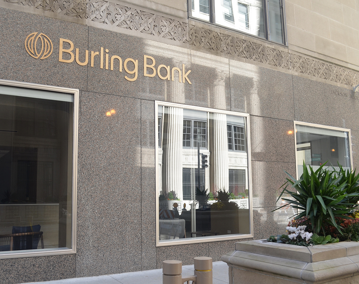
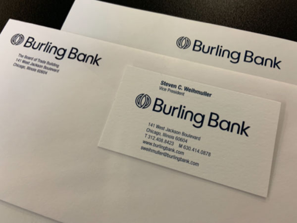
Burling Bank has served the heart of the Chicago financial district in the Chicago Board of Trade for 30 years. The brand has a future-forward focus that manifests in tech-enabled convenience that allows customers to connect and transact from wherever they are. They needed to promote more online access, yet keep their true differentiator as an authentic brand that builds personal relationships with customers and in communities. An imminent office move would soon transform the bank experience from a traditional, interior filled with dark paneling and deep leather tones and to a light, bright modern space. It was the perfect time to work on a new value position and messaging, as well as a new visual identity, logo and interior graphics collaborating with the architectural team.
A new brand strategy
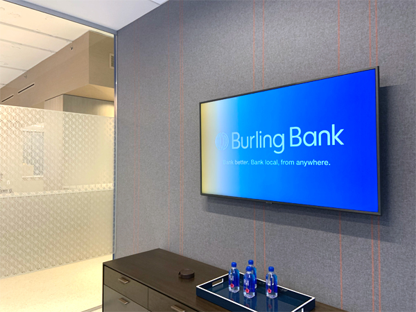
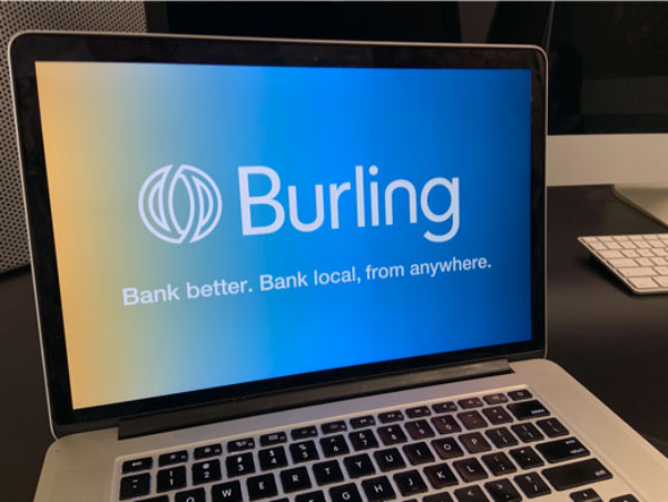
To start, we created a value proposition true to the brand, “Bank where you are, with people that know who you are.” That value proposition set the foundation for the streamlined tagline, “Bank better. Bank local. Bank from anywhere.” This tagline became a focal point in communications.
The visual identity
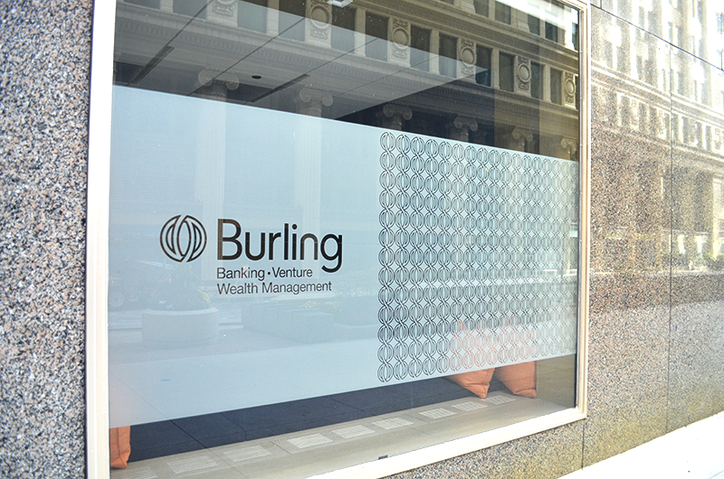
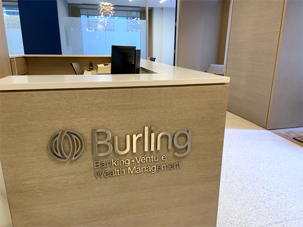
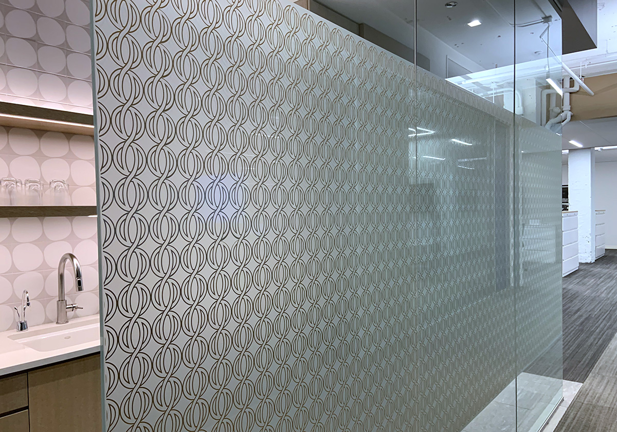
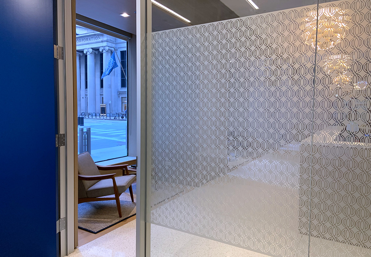
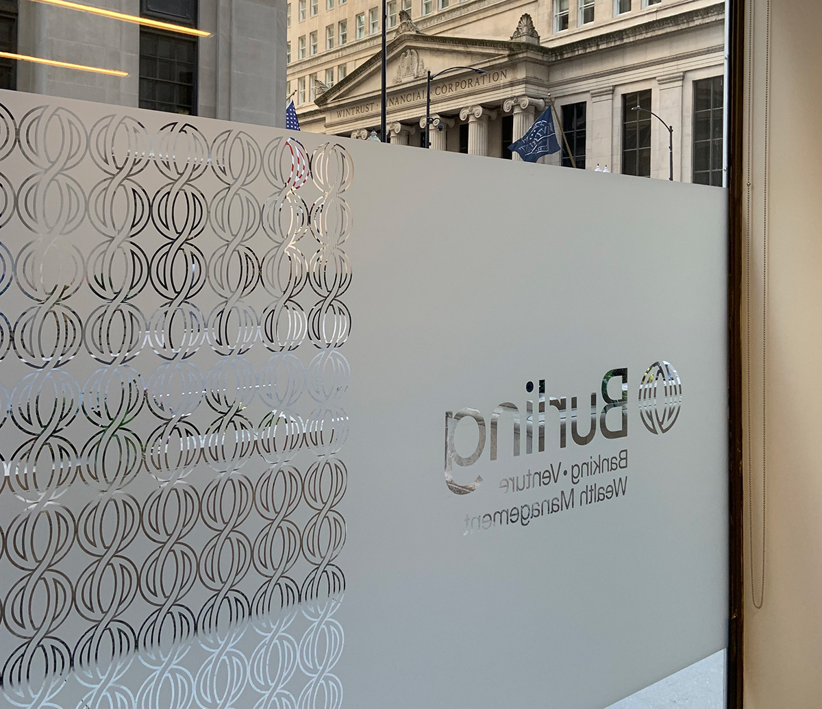
We modernized the brand identity starting with an evaluation of the logo. Historically, the logo had been built with an older serif font, reminiscent of classic old banking. We completely redrew the font as original sans serif artwork, with clean modern shapes and refined proportions. The actual circular logo art was redrawn with a thinner stroke, so it could scale easier in smaller digital formats. The circle logo artwork became the basis of a geometric pattern that formed privacy screens on inside and outside windows. We worked with the architect and signage company to align the brand elements with the build out of the new space.
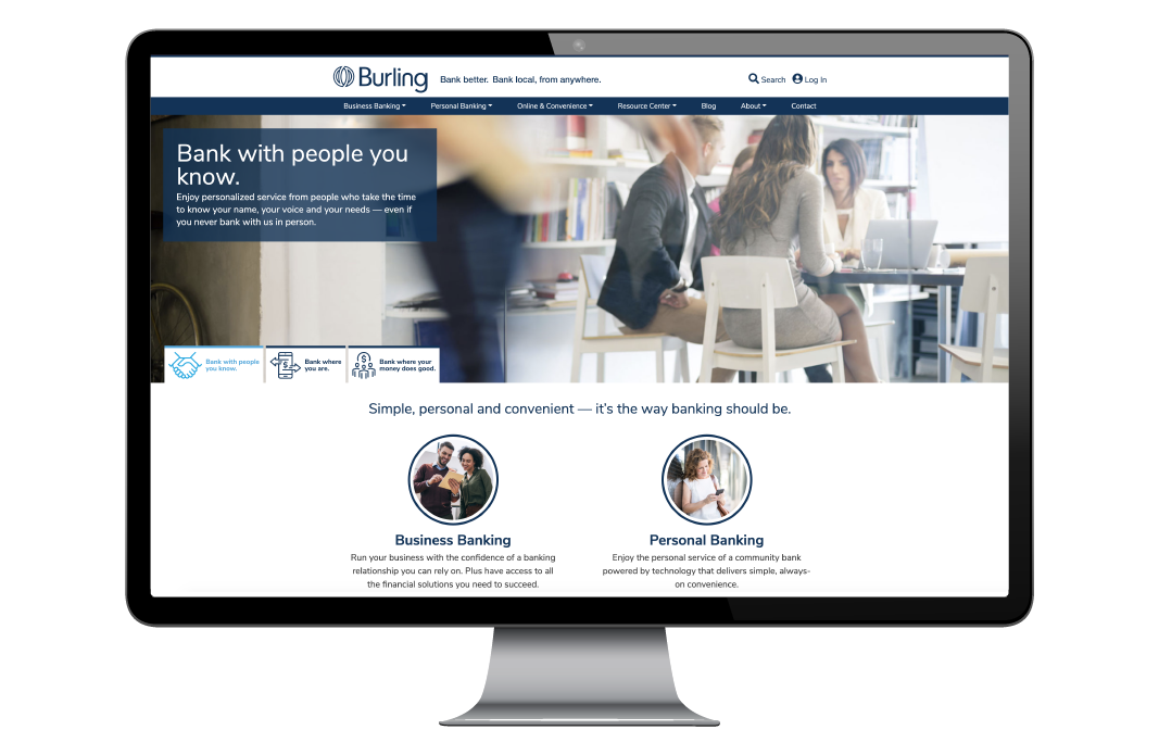
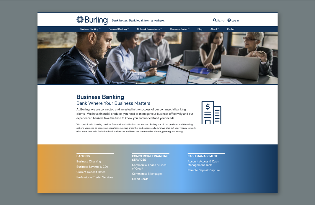
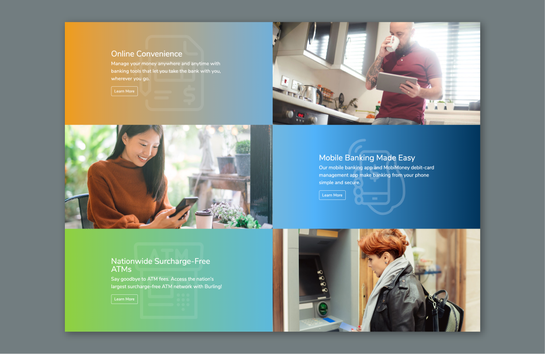
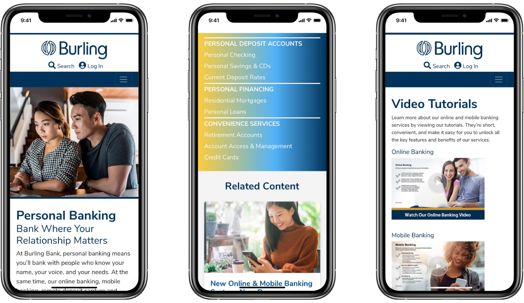
The website is easy to navigate, and highlighted with a fresh color scheme that coordinates with the bank’s interior. The website not only provides useful product information, but timely blog posts with news and updates. These were particularly effective when bank transitioned to support customers digitally during the global pandemic.
Today the bank’s brand refresh reflects a clear story, with a friendly, approachable voice, and value proposition that comes through in every aspect of the brand, including the redesigned website. Bank where you are, with people that know who you are. It’s simple, personal, and convenient–the way banking should be.
Work Completed
- Company Rebrand
- Visual Identity and Logo Refresh
- Defined Brand Story
- Value Proposition and Messaging
- Website Design and Content
- Interior and Exterior