
Naming, messaging, value proposition and brand identity for a growing packaging supplier
Oakland Packaging and Supply has been solving the custom packaging and facility supply needs of companies in Northern California and the Bay Area for over 30 years. But they had long ago moved from the Oakland location where they started and expanded services to support many of the region’s fastest growing companies. The burgeoning economy and a solid business model created an exceptional growth opportunity for the company. But they needed to tell their full story and decide on whether a new name would be worth the change.
The brand strategy
We started by interviewing internal team members including, management, sales and facility support to learn the depth of the company. We got a very detailed view about how the company worked, their processes and particulars regarding customer relationships. Next, we interviewed many customers in various industries that gave us a full view of how the company looked from an outside perspective. Customer interviews were set for half our timeframes and many conversations exceeded our expectations.
We took all of the insights from customers and employees to determine a name change would be necessary to grow the business, and set them apart from their previous location based name. In the interviews we learned first hand, that the company had a knowledge base in helping customers in the packaging industry that was unparalleled. They helped not only solve a packaging problem, but could recommend streamlined solutions for a customer supply chain that would save valuable time and money. In short, they came to customers with solid, clear solutions. Their thinking was Cogent. We presented many business name ideas, however, the one that stood out and defined their approach to industry solutions was Cogent. It’s short, two syllables and easy to say and remember.
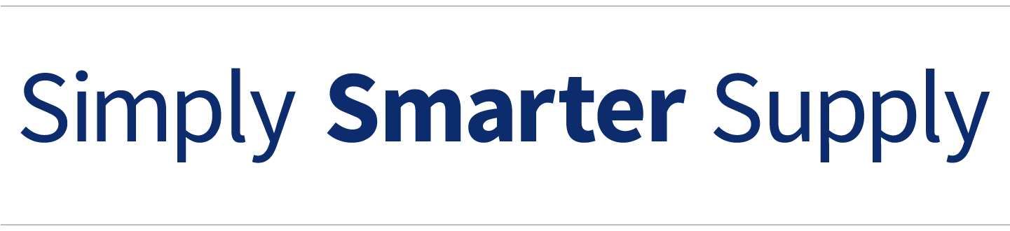
The tagline we created aligned very well with their business model. “Simply Smarter Supply” breaks down into three sections. 1. Simplifying business processes. 2. A smart approach to efficient solutions and problem solving. 3. Supply is the smarter way to deliver supplies in the supply chain. Thinking, problem solving and consultation are in good supply.
The visual identity
The logo was built specifically for the word, by aligning every letter to form a ligature from end to end. The solid blue color sets a solid foundation and the accent color red is a spark for “O.” The highlighted “O” is a brand element used to bring focus to specific text or image.
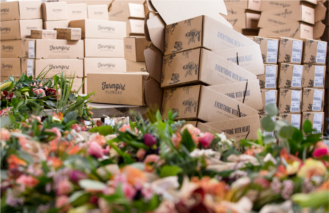
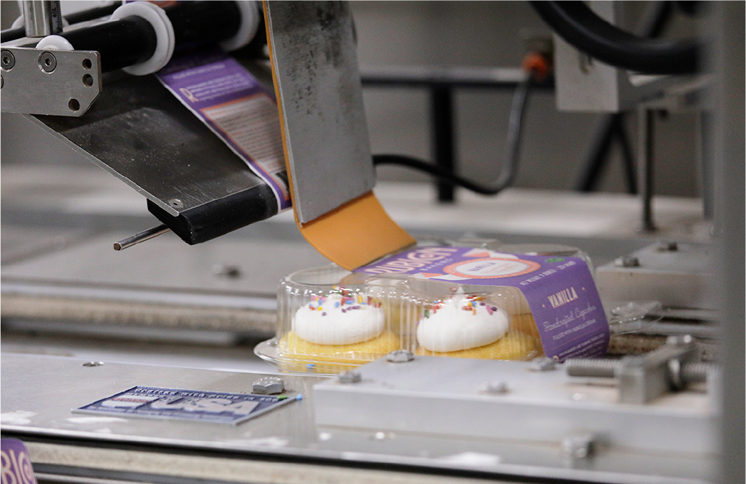
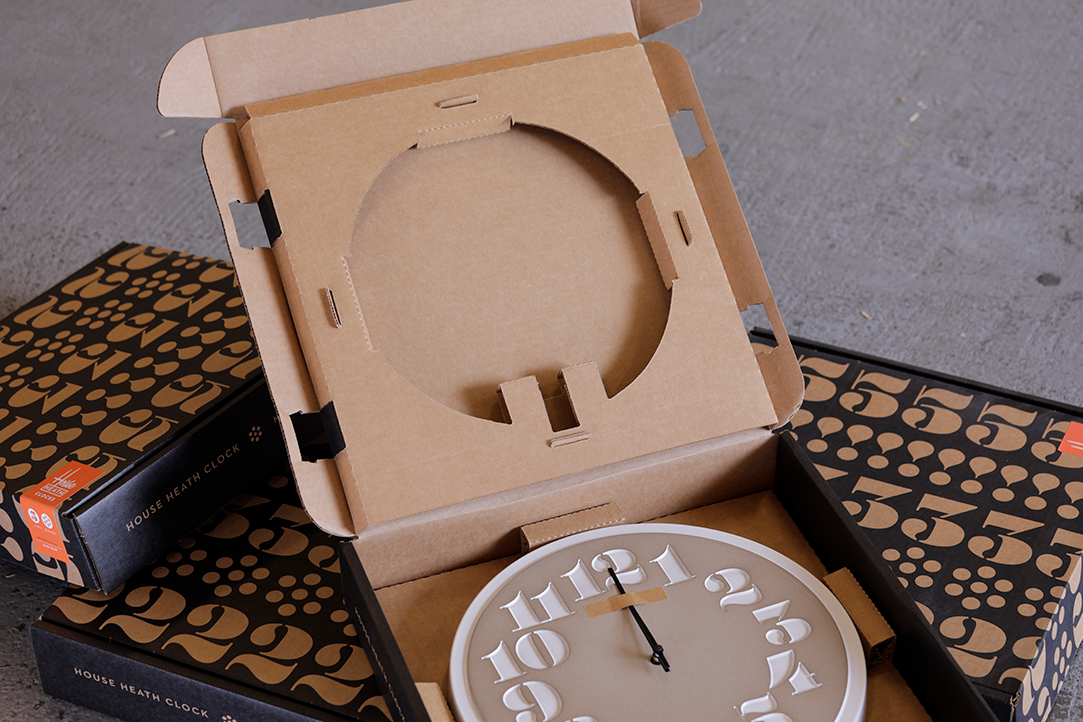
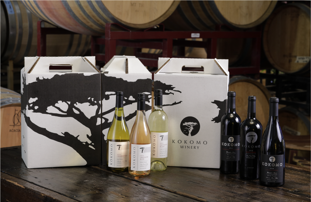
Photography played a key role in the brand strategy. Cogent needed to show their products in action at their specific customer locations. This involved coordinating photoshoots in 15+ locations shooting examples of everything from packaging products to large machines in action. We shot video at the same time so we could build mini movies detailing the type of products Cogent sells.
We helped the brand launch with a presentation to the entire company where we described the process of the brand development and shared the details that brought about the name change. The employees did not know what the name was going to be until the presentation. The new name and brand strategy was well received and a party ensued to celebrate the beginning of the new brand.
Cogent has been able to focus on operations and expansion since the name change resulting in positive growth for the company.
Work Completed
- Rebranding with complete renaming, visual identity and repositioning
- Full messaging strategy
- New voice and tone
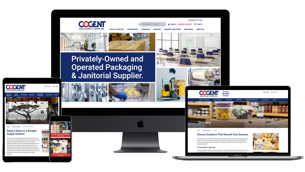
- Robust customer website built with Insite Software’s ecommerce platform
- Marketing tools and communications