Value proposition, messaging and visual identity for a growing packaging supplier
Pollock paper was experiencing a brand challenge: The industry was facing new competitors with solid brands and deep pockets. Pollock had great business and strong relationships, but was struggling to communicate the magnitude of solutions they offered to new companies.
We started to understand the company by interviewing key stakeholders in the company and customers. The insights gave us a sense of their commitment to customer service and the depth of their product line. Pollock sold much more than products. They solved problems related to manufacturing, service and logistics. They met with clients and developed deeper connections with manufacturers and subject matter experts that brought real solutions to the relationship.
We created a robust value proposition that set the voice and tone for the brand.
“Where Solved Happens” became the tagline and focal point for campaigns and communications. This tagline created many options for the brand to be positioned as the solution provider.
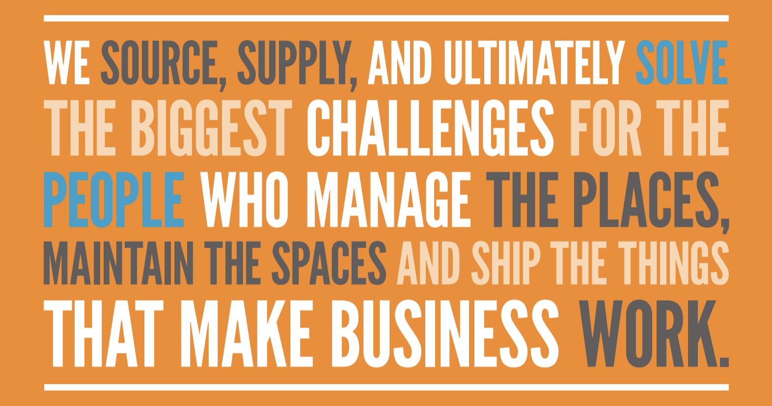
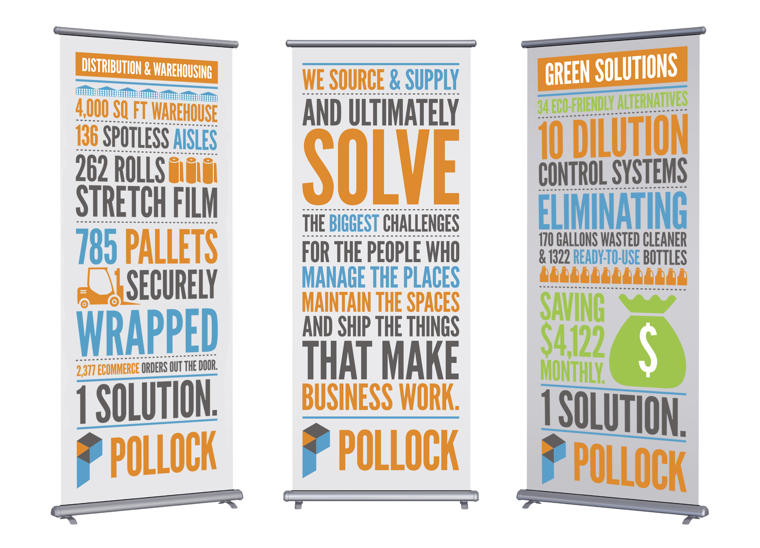
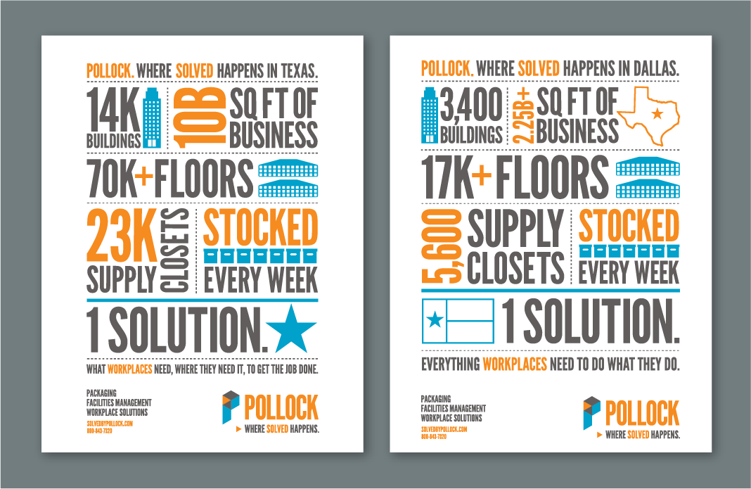
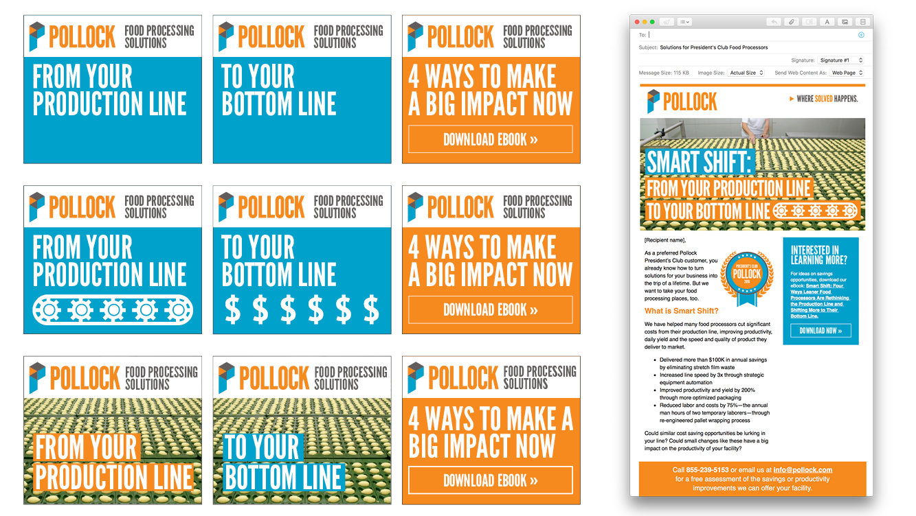
A vibrant new visual identity was created starting with the logo. The letter P was built with a series of shapes that also made a three dimensional box. The graphic language of the brand included typographic emphasis that focused on specific words and numbers in headlines, case studies, insert sheets and posters. This brought the brand voice to life as each asset communicated a different “solved” story.
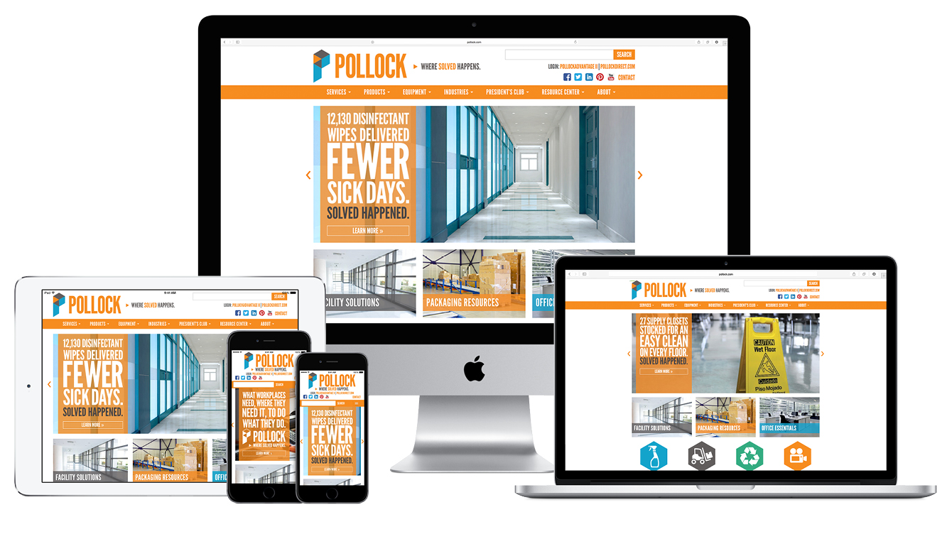
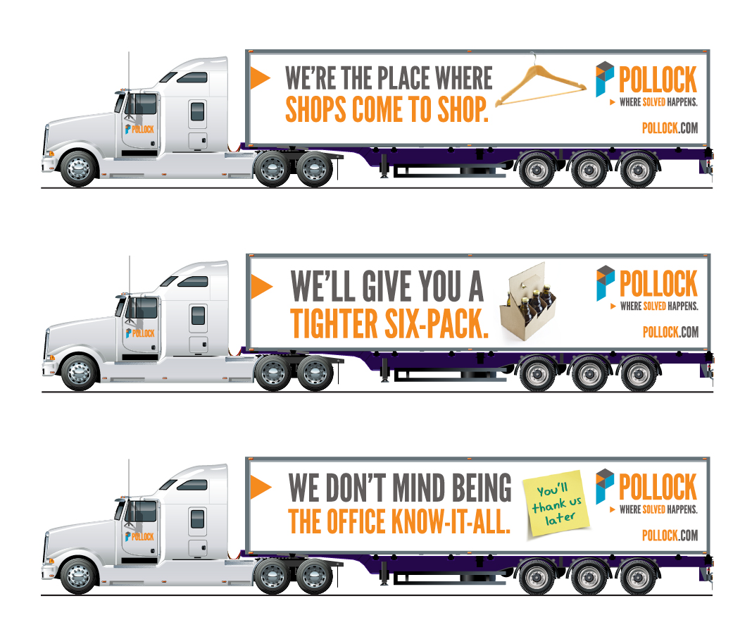
Pollock also maintained a large truck fleet that gave them a platform for brand impressions on the road. Truck campaigns were constructed with fun memorable headlines that aligned with the brand and were consistent from truck to truck. People tell us all the time when they see a “Pollock” truck. Other customer touch points included an updated website, a series of microsites, sales presentation tools and digital content campaigns, all to pave the way for the next phase of company growth.
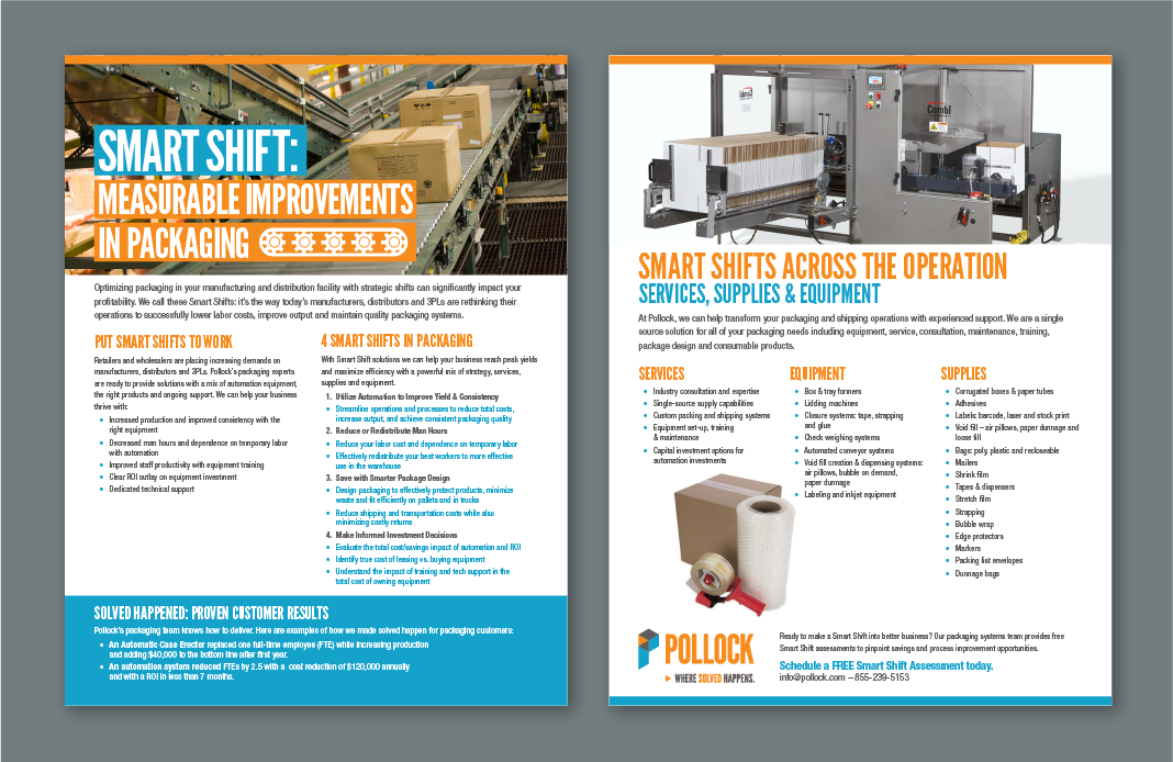
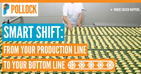
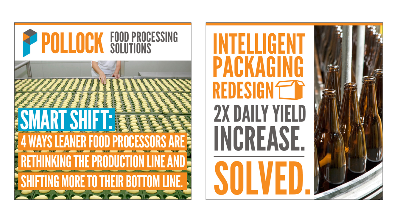
We helped Pollock identify industry trends when we created a campaign about food production focused on the “Smart Shift” with new production opportunities. The campaign showed customers multiple ways to think about production challenges and how Pollock could shift thinking to a new solution. This campaign was supported by digital ads, direct mail and a microsite.
The Pollock rebranding campaign was very successful. The brand platform gave the company the strategy it needed to focus on their strengths and take the company to a new level of customer relationships.
Work Completed
- Complete brand identity
- Messaging, value proposition, voice and tone
- New tagline "Where Solved Happens"
- Website development
- Truck wrap campaign