Naming, messaging, value proposition and brand identity for a growing company
Newtown Office Supply was once a small town office supply company in eastern Pennsylvania. Growth through acquisitions positioned them to become a major player of business interiors and supplies along the east coast, providing everything from office supplies to space planning and design. Their growth in Albany, Philadelphia and New Jersey extended the company’s customer base, geographic reach and category expertise. One issue that held them back was their small town name.
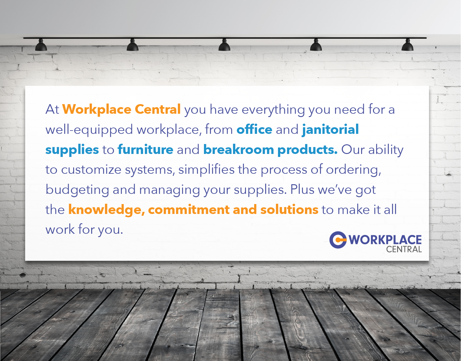
We started by interviewing key team members including management and sales to learn the details of the company. We also interviewed customers to gain a complete understanding of the value the company delivered and how they differentiated from competitors. In this process, it was apparent that the current name was an issue and they needed to market with a bigger, bolder brand in order to grow. In the interviews we learned first hand that the company offered more than just office supplies. They were a resource that could reimagine an entire office from front to back. Their expertise eclipsed every part of an organization with product recommendations that solved problems large and small.
Three ideas stood out in separating them from the competition:
- They were a reliable resource for a wide variety of products and services.
- They simplified the procurement process by offering many solutions through one vendor.
- They solved many issues regarding purchasing, order fulfillment, inventory and logistics.
In short they were a central resource for the workplace.
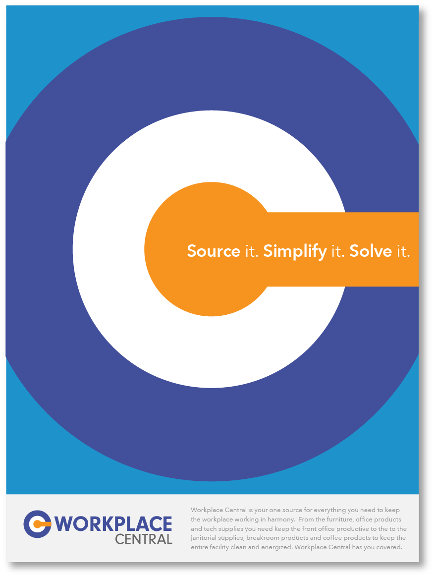
The name Workplace Central was created to clearly highlight the single-source support they are for everything in the workplace. Once we had the name, the tagline was created to align with their values of resource, simplicity, and solutions. “Source it. Simplify it. Solve it.” This became the focal point for the business as they grew.
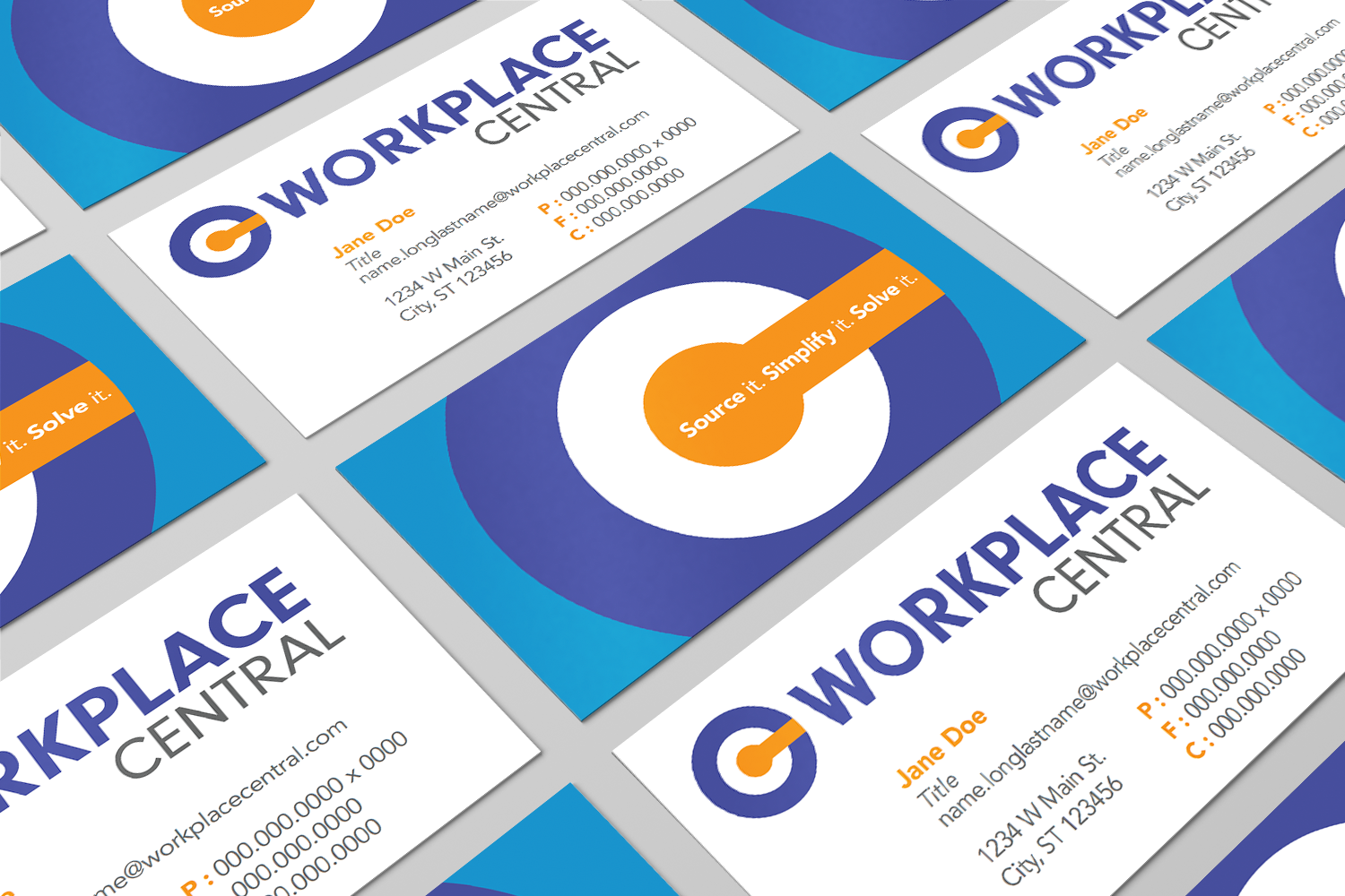
The logo was built around the C letterform using the counter (center) as a focal point. Bold colors highlighted the logo and became a central point of the graphic language in communication materials. The negative space in the C logo has powerful contrasts and holds up well in the digital world.
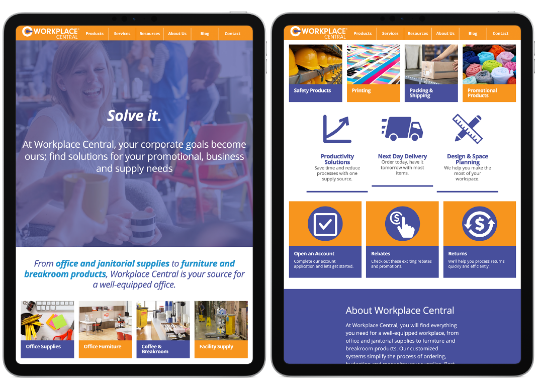
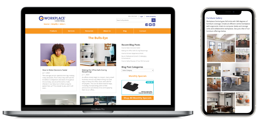
We created all business assets including communication and premium items. The website was built as a front-end to their eCommerce platform. The site details all the products and services they offer with a sample gallery of furniture installations. The brand has been very successful since launch. More growth and acquisitions have been made, extending the reach throughout the region.
