
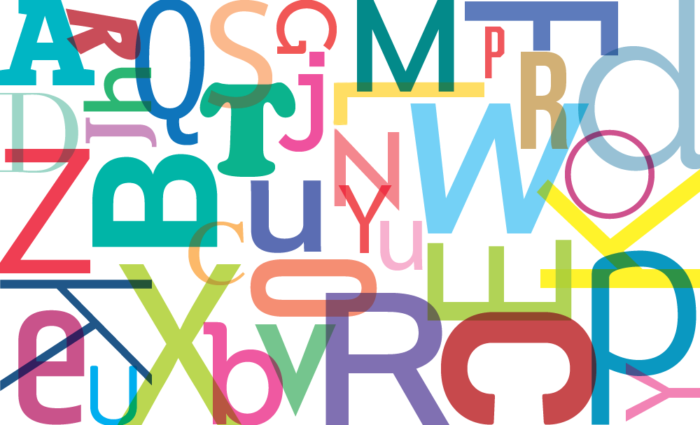
Classic fonts, Google fonts, and your brand font compete for compatibility across all channels.
Recently Communication Arts Magazine published an article about the future of “Fonts at Risk.” The article focused on a variety of classic fonts such as Adobe Garamond, Frutiger, and Helvetica in danger of going away because they are being used less and less as brand fonts. It’s true, there has never before been so many font options available (hello Google fonts) with new versions debuting constantly. Helvetica now has three versions, old original Helvetica, Helvetica Neue, and Helvetica Now — the last version recently rebuilt for smaller sizes.
Why is a classic font like the original Helvetica at risk?
Because designers can download at least six look-alike fonts for free — that’s part of the answer. Google has certainly streamlined developers’ workflow with screen optimized look-alike fonts. But there’s also an underlying issue of compatibility that’s making font decisions more challenging.
Your brand font is important.
Fonts are a critical partner in brand design as they help define the overall brand look, and set the tone of the brand even before someone reads the content. However, they’re also part of the software eco-system like all other files, and not immune to program compatibility issues. Unlike print, digital communication has many channels, with different options. You should understand how your brand font fits into the different channels and where compromise makes sense.
Let’s look at decisions that have to be made as your brand font is seen through different channels.
How important is the font on my website?
75% of the credibility judgment of a company, is made when viewing its website. Your brand font plays a critical role in legibility and thus the overall user experience. Can you choose any font for your brand and use it on your website? In a word, yes, however, some fonts are better optimized for screens than others. When you purchase a font from an independent resource, you may have to upload the font manually. Fonts have file formats like everything else, and there are four different file types, TTF, OTF, WOFF, and WOFF2. Depending on where you purchase the font, they may or may not give you all the different file types. In that case, you can convert a file to the format you need, using a tool like Font Squirrel’s Webfont Generator.
Why do I care about how the fonts are installed on my website?
Well, someday there will be a WOFF3, WOFF4, and other formats TBD. You can count on it. If you have only one website, manual font updates are not a problem. But if you’re responsible for multiple websites you’ll want a smoother workflow. Updates are important because not all browsers will see the latest font versions right away. You could also use a font repository to handle fonts automatically.
What is a font repository?
Many developers use a font repository like Adobe fonts (14,000 fonts), Google web fonts (960 fonts) or Font Squirrel, to load your font when someone lands on your website. Adobe is a paid monthly subscription, Google and Font Squirrel are free. Instead of manually loading the font on your server repositories will take care of all file formats and when new formats are created, it’s updated automatically. This streamlines the workflow process especially if you have to maintain multiple web properties.
Website takeaway: Use a font repository like Google or Adobe to ensure the latest font formats are loaded and will be updated in the future. Although Adobe has a much larger selection, Google gets the edge here because their library is free, the fonts are open source, and their repository is easy to use. Most Google web fonts were created for better screen legibility.
Can my brand font be used in a marketing email?
You’d think with 100+ billion daily emails sent from brands to consumers, there’d be an open-source way to use any font you want. Haha. Email legibility depends on the email client the recipients use and to some extent the fonts loaded on their computer. It’s hard to predict what fonts are in your recipients library, let alone what fonts they have access to use. Apple now has many preinstalled fonts in their latest OS system, but again, not everyone has a Mac. It’s best practice to use the fonts available to all platforms and at a basic level these fonts are cross-platform and would be found on most computers.
- Arial
- Courier
- Geneva
- Georgia
- Impact
- Monaco
- Tahoma
- Times
- Trebuchet
- Verdana
Unfortunately, that list is also dependent on the version OS the user has installed. If you absolutely have to see your brand font, in a headline, then go for it…as artwork. It will render fine on desktop, laptop, but scale down on tablet and mobile. It’s a compromise.
Now you may say, you’re using Google web fonts for all of your emails and Google can load the font just like a website. Yes and no. It depends on the email client your recipients use. Currently, web fonts are supported by these applications.
- Outlook 2000
- Outlook.com (app)
- Apple Mail
- iOS Mail
- Android (mail client only)
- Mozilla Thunderbird
Gmail doesn’t even support Google web fonts.
Here’s a cute twist — As of this writing, Gmail only supports one of their own fonts, Roboto. If you send an email using Google fonts, users who use Gmail will see a backup system font as a substitute.
E-mail takeaway: As much as you love your brand font, it’s best to use one of the fonts that works cross-platform. Use artwork only when necessary for large simple communication. Test excessively and view on as many email clients as possible.
Will my brand font load in Powerpoint?
Well, it depends on your platform, Mac or PC, and the version of Powerpoint you’re using. Older versions of Powerpoint are more compatible with some third-party fonts. On Macs, older versions of MS Office have no problem loading Google fonts, yet newer versions of MS Office don’t see Google fonts at all. Powerpoint loads the font based on the users font library. If you share a deck, filled with your brand font, then the recipient must have your brand font loaded locally to see your presentation correctly. The last thing you want is to go looking for a font when you receive a Powerpoint deck. We suggest it’s best to send only a PDF of the Powerpoint file rather than the native file.
Powerpoint Takeaway: Microsoft software has always been proprietary vs open source. When using their products, it’s best to stay in their eco-system and use a standard cross-compatible system font that every user will see.
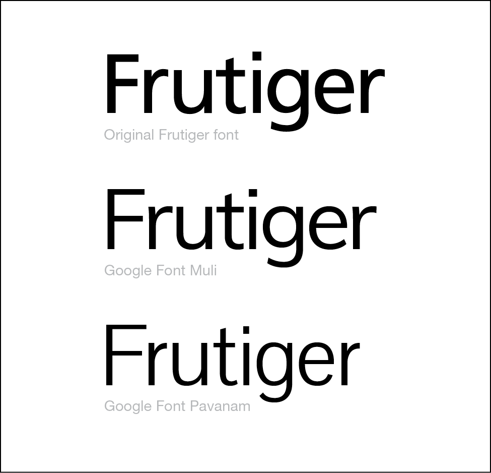
| Frutiger | Muli | |
|---|---|---|
| Cost | $35.00 for a single font. $300 for compete family of 18 weights. | Free |
| Can be loaded for my website? | Yes | Yes |
| Part of a font repository? | Maybe, depends on where the font is purchased. | Yes & free to use |
| Can be loaded in a marketing email? | You can try, but it won’t be supported by the recepients computer unless they have that font installed. | Yes, supported by most email clients except gmail. |
| Ok to use in Powerpoint | Depends on version of Powerpoint and the OS. | Depends on version of Powerpoint and the OS. |
What does this all mean for fonts at risk?
In the end, no matter how stringent your brand standards are, there will be compromises ahead. It’s easy to think that just because the font shows up for you, it will look like that for others. That’s not really true. Why do developers lean toward Google fonts for the web? Because they’re free and easy to work with for both email and websites. Why do we keep email text simple? So everyone can read it regardless of the email client. Classic fonts are disappearing because designers and developers are juggling compatibility and compromise at the same time.