
The Color of a Champion
Now that Super Bowl 50 is in the books it’s time to look beyond the chalkboard to other supporting factors that might help lead up to a champion. We wondered if championship teams had more in common beyond great athletes and coaching. Was there another intangible
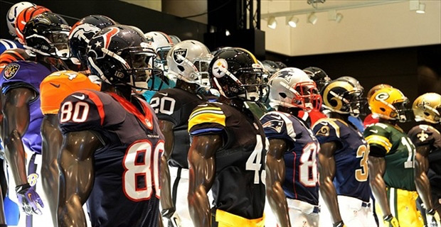
You can tell a lot about a sports fan by the clothes they wear — the passion, the energy and the expense to blend in or stand out with their tribe. We wondered if championship teams and their fans have anything in common on the color wheel. Never looked at it until now, and sure enough there’s some interesting similarities. This is not a scientific study, but a simple observation about championship teams, specifically Super Bowl winners.
Some minor rules.
Every team has a primary team color and an accent color. We chose to focus solely on the major team color — not the accent color and not their white jersey – every team wears white. We’re more interested in the overarching color that defines the brand. We asked these questions;
- What’s the primary color that defines the team overall?
- If we were to look into a stadium of fans, what’s the the dominant color we’d see in the stands?
- What’s the unique color that separates the team from all others.
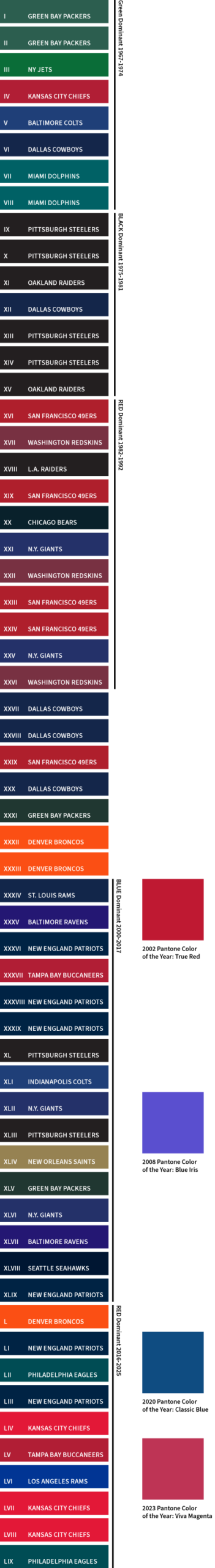
The chart (right) is based on one primary color, the single dominant brand color, not the color the team wore in the Super Bowl. The Super Bowl is only one game, and we were more interested in understanding the color promoted by the team and fans throughout the year.
Upon review the colors align.
Dark colors are generally a good thing — bright colors not so much. We can group some fairly distinct eras of color.
The early years – 1967-1974
The NFL makes lots of green, and green is the color that started it all from the Packers to the Jets to the Dolphins. Is there a cultural influence? Look at images from the late 60’s and early 70’s — green really was the flavor of the day in everything from carpet to counter tops. Even though the green these teams use are all very different, they’re not all that far from the average avocado colored refrigerator.
The dark years – 1975-1981
A whole lotta Pittsburgh and Oakland, black jerseys were hip, serious and stark. Yes, those were some dark years of high inflation and other pressures society was working to resolve. Never really associated the tenor of the times with the color black, but the colors do align with the mood of the country.
The 80’s – 1982-1992
The 80’s were defined by bright, vibrant hues, that almost glowed. The team that shined the most in the 80’s was the SanFrancisco 49ers with a definitive 4 championships — followed by the Washington Redskins. However these (red) team colors didn’t fall prey to 80’s color trends, they just won 7 Super Bowls out of 11 years.
The conservative choice – 2000-2017
Dark blue, light blue, deep blue green, doesn’t matter because it’s good to be blue. New England Patriots make the most of this graphic, with help from the Giants, Colts, Seahawks and Rams. Blue Iris was chosen by Pantone as their “color of the year” in 2008 but it’s more purple than blue and yet aligns a bit with the Baltimore Ravens. Overall, blue is a simple conservative color to build on, and it’s an easy color to sell to fans.
Red begins to dominate…again 2016-2025
The rise of the Kansas City Chiefs championships and another championship by the Buccaneers, brought back red in a big way. For a while it seemed like every media outlet showed the Chiefs and their fans constantly decked out in red. A fun coincidence is the Pantone color of the year in 2023 was… Viva Magenta.
The end game.
More similarities than differences – it’s interesting to see how team colors tend align together and sometimes align with society at large. Even more interesting, will be to review the colors of the losing teams. One hint for the losing teams, brighter and more colorful is not always better…unless you’re a fan of the Denver Broncos.